Friday, 24 February 2012

Creativity Magazine Talent Spot Cards. Issue 32, March 2012

I'm so excited to be able to share these pictures with everyone now. I have been itching to get them on the gallery since I made them in December. It's really great to see them in the magazine. I have some text I wrote out, on how I made these cards, but I can't seem to find it, so I'll have a little look round my computer and hunt it out and update this post when I find it.

Here are the pics of the cards.


Sunday, 19 February 2012

B is for Bling

I have been working hard on my commissions this weekend, they are mostly for children. One with Upsy Daisy from In the Night Garden, George from Peppa Pig, and Princess Aurora from Disney. The other two are grown up cards. I think I'm really enjoying doing the kids one's, I'm getting back to my girly roots as a child, playing with glitter and pipe cleaners! Sometimes its nice to get away from the grown up stuff all the time.

B is for Bling
Strewn with jewels and glitter, this letter had to be blinged up. Not much explanation needed for this creation other than I used, glitter, gems, beadazzles, beads, ice Sparkles and a few drops of alcohol ink.


I love these strands of hairy glitter. The black glitter on the inside of the B shape is also hairy glitter.


Another 'B' to come next, i'm thinking B is for Beach........

Friday, 17 February 2012

O is for Ornate

Oooooo it's about time I did another letter, and here it is, an eternal circle of ornateness. I took some sneaky pictures of the 'O' while it was being made on my WOYWW, and now here's the finished letter.  I keep meaning to take more pictures of the making process, but it's so hard to remember to take a picture.....well what I mean to say is, it's so hard to get my head out of my crafty behind to stop for minute and think that I should take a picture.  I will make more of an effort for the next one.  I had to stand the letter against a bottle of glue to help it stand up as the ornate plaque makes it want to lean over to the right a bit.

So for the ingredients of this recipe:
I painted the letter with white acrylic paint first as a base. Then I used a wonderful pink shimmering mist by Lumin Arte inc. called Radient Rain Pink Grapefruit. It has the most fantastic gold mica shimmer with a soft pink colour underneath. I was so surprised with the finish of this mist, I loved it. I know I will use it over and over again, so pleased it comes in a big bottle too.  It looked fab just like this, but not interesting enough to look at. So I used a contrasting pastel blue Cosmic Shimmer chalk mist over the top, I like the mottled effect it gives (use a heat gun to dry in between coats).

I stamped a few flourishes using a pastel blue Brilliance ink pad too here and there.


The most exciting part for me was using 2 new products I bought at the weekend from The Paperlane in Northallerton, unfortunately for me they were having a reshuffle of the shop when I turned up on Sunday morning and I didn't stay long......wait...not unfortunate for me at all....very fortunate on my bank account! I always spend, spend, spend in there, they did me a favour.  Thanks a bundle!

My 2 new products were Indigo Blu's Gilding Flakes (and flitter glue.. I know that makes it 3, but the glue goes with the flakes, come on, that doesn't count) and the Hummingbird clear stamp set from Kaiser Craft. The effect is amazing on the letter, and the camera doesn't pick it up so well, but it looks really great up close.


The ornate plaque is a Tim Holtz Idea-ology plate. I used Sail Boat Blue Adirondack alcohol ink, and dropped it a few times over areas of the plaque. I cut out some card, stamped an ornate O on the card and wrote the rest of "Ornate" out (I know it's not perfect, but I like it warts 'n all) . Distressed the edges of the card, stuck it in the plaque and filled the oval with Glossy Accents. Which takes an age to dry.


The stamped bird and flourishy flowers are Tim Holtz as well as the ink dyed bauble. The crown is a charm I picked up at a craft show.  The cat stamp is a Lavina Stamps cat, coloured with dark blue acrylic paint, and outlined with a thin black pen.


I picked up on the centres of the stamped flowers with some Cosmic Shimmer pearl pva glue and some yellow liquid pearls (I need an excuse to use liquid pearls on everything).  

Around the edge of the letter I painted bright yellow acrylic paint and flicked it with purple mica powder, the letter shimmers from lots of different mediums. Oh I can't forget the centre of the letter O which I coloured with blue Broken China distress ink.


 B is the next letter, I know what the first thing springs to mind beginning with B is, what do you think?

Wednesday, 15 February 2012

WOYWW 141

This is my first time posting on the WOYWW.

Here's a sneaky peak of the 5th letter in my series of 12. The Decopatch letter 'O'. I'm thinking Ornate being the theme for this one, although not quite there yet. I still have a few ideas kicking about and don't know which ones to go with yet.  I normally reach for the nearest Craft Stamper and inspiration strikes.


I have 5 commissioned cards to do for Monday, so this weekend is going to be pretty busy.


Sunday, 12 February 2012

A wash with colour

It's the weekend again, oh how I love them, I wish I had a Saturday Groundhog Day and wake up on a Saturday morning every morning, until I had crafted myself out. I reckon I could keep going for a few years!

Below is letter No. 4 of  the 12 I intend on decorating.  My intention with the design of this letter shifted from my initial ideas. I wanted just a monochromatic letter. I painted it white, and stamped the words all over it, distressed it a little with Scattered Straw Distress ink, blackened the edges, and made the little book, I was going to leave it like this. I thought it looked simple and I liked it. But then I went to sleep and woke up the next day, and I thought it needed colour. So I went for a splash rather than changing the colour of the letter completely.


Do I want to stick with trying to decorate the letter with a theme associated with the letter itself  i.e. 'H' is for Happy, 'E' is for elegant. Some ideas I want to do don't even begin with that letter, I'll just have to go with the flow and see what happens.

The book was a little bit of fun to make. I stamped up an A4 sheet on both sides with a Debbie Moore written word stamp, it looks quite Medieval don't you think? Then I cut the sheet up into rectangles. When I thought I had enough pages, I stapled them twice in the middle to secure them, then glued them to some brown card. I distressed the edges, and stuck a small square of the text on the front for effect. The butterfly is a Tim Holtz stamp and the pen nib is also from T!m's idea-ology range.


The next day, I decided that was it, the letter had to have colour on it, colour made me happy and I would always want to put some on.  So without thinking I put a paintbrush in some thick white acrylic paint and painted a lightning streak across the letter, much to my son's horror. I then got my Adirondack alcohol inks out and dropped ink on my lumpy acrylic paint.  


I could see it taking shape, it was just what I wanted. And then......Happiness is a splash of colour!.....The sentiment was born.....I knew it felt right now, it was the colour it needed all along.  I did the words by painting a blank piece of white card with a thin layer of white acrylic paint, then dropping the same coloured  inks I used on the letter on the piece of card, then dried it with the heat gun. I then got my Hampton Art alphabet set and stamped my words out. I cut each word out and matted them onto black card.

I had been inspired by Dina Stamps Ponderings blog with the white acrylic circles and wanted to put a few circles on my letter too. I find myself going back to Dina's blog nearly everyday, I just love her artful creativity, really inspiring. http://dinastamps.typepad.com/ponderings/


The next letter is 'O'. I have a couple of ideas, but no doubt they will change. I'm at a wedding all day tomorrow, so won't get chance to craft or upload. :-(
Happy colourful crafting folks!
Michelle x


Here's a blog with a great monochromatic challenge, my creation falls out of their rules, seeing as I chucked a load of colour at it. But just wanted to share their lovely creations on here because they are all so inspiring. http://fashionablestampingchallenges.cottagecrafts.ie/?p=2541#comment-274


Thursday, 9 February 2012

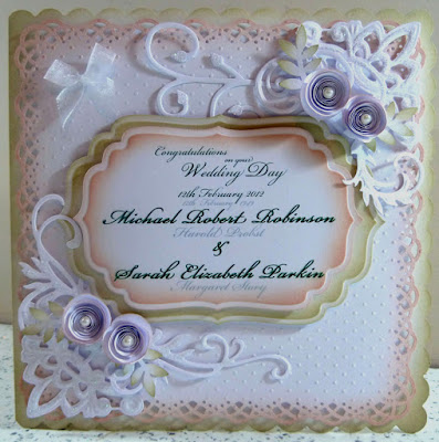
Bespoke Wedding Card

I was looking forward to making this card very much, I had been thinking about the design for a while, that's not like me though, I don't really know what a card is going to look like before I start it. It just usually starts to take shape as I'm doing them. But this wedding card had a story and I wanted to show it somehow.

If you notice there are two sets of names on the sentiment. Michael & Sarah and Harold & Margaret. Harold & Margaret are Sarah's Grandparents and Sarah wanted to get married on the same day they got married. So I wanted to show that on the card. It then makes the card a special one for keeping too.

There is a die cut frenzy going on here. There is Spellbinders flourishes, Marianne corners, leaves are punched out, and the large white embossed card by Craftwork Cards has a punch around the corner lacy design. The sentiment is cut using Spellbinders Grand Nestabilities labels. The rolled up paper flowers are all the rage at the moment, with little pearls in the centre. I only used 2 distress inks on the whole card. Old Paper and Tattered rose.


Of course the inside has to look the part too. Using Papermania vellum and Kanban card.


Oh and there is some Glamour Dust glitter on the front too.

Sunday, 5 February 2012

E is for Elegant, Embellish & Emboss

But first I'll have a little ramble
Craft tote
I picked up a bargin today in The Range. I've been toying with the idea of getting a craft tote, and I saw the big Papermania totes which usually retail at about £49.95 and it was in The Range for £39, so I got it.  I'm planning to take some of my crafty stash on the C&C cruise.  There's just some things you can't live without if you're crafting.  I'll have to make it unique to me though by putting something on it, I don't know what just yet, but you can guarantee I'll put it on here when I do.

Paper mache addiction
Can you get addicted to decorating paper mache? And if so what do they call it? Mache mania, or papaholic or something daft like that....maybe alphaholic :-).  I think my little project of decorating the 12 letters which spell 'The Hobby Room' has turned me into some massive procrastinating shirker.  

There is loads of housework that needs doing, and I did the bare minimum this morning, i.e. hoovered and tidied up as fast as I could, just so I could get back into the craft room and do another letter! It's like I have to get my letter decorating fix.  I'm even thinking of what else I could spell out!  I need help.


'E'  is for Eeeeeee Howay man, deeas a nice letta man! (In my best Geordie accent, I don't have any other).
I went for a more elegant, girly, bright feel with this letter.  I really wanted to put a little crown on the top too.  


I started off with drawing around the letter onto a piece of card and then cut it out.  Then I painted the paper mache letter with white acrylic paint and left it to dry while I coloured and stamped the E shaped card.  


I stamped the white edges of the letter with Crafty Individuals (CI-293) flowers rubber stamp set.   I didn't have any bright pink ink pads so I used a bright pink Promarker on the stamp and stamped it on the letter before it dried. I used distress ink pads on the other colours of the stamped flowers to match the colours on the front. 


I used Tim Holtz masks before distressing the edges of the E shaped card with, Shabby Shutters, Peeled Paint and Mustard Seed distress inks.

I stamped the front of my cut out with Crafty individuals Flourish stamp (CI-182) and the Tim Holtz ornate corner stamp with Versamark and heat embossed bright pink embossing powders on the top and bottom of the card. I also stamped the front of the card with The Stamp Man's Aspects of Design (58) Fancy Flourishes, these are the green and yellow grasses and dotty flourishes.


I bought some wooden butterflies and birds last week from Hobby Craft and I coloured in one of the birds with distress inks and put this on too.  The stars on a chain is from a necklace I spotted in Primark, and thought I could use that for embellishing...and so I did.


The finished article. 

However, the pink does not show up well on these pictures, it is much more vivid with the naked eye. One day I'd like to have a bricks and mortar shop, and I'd put these letters on the wall inside........I have to believe in my dreams. x


I have entered this letter in the Stamp Man Challenge, Embellish it. http://thestampmanchallenges.blogspot.com/2012/01/stamp-man-embellish-it-challenge.html
And Also
Crafty Individuals February 2012 Challenge.

Saturday, 4 February 2012

H is for Hearts & Heat Embossing

Not triple embossing but rather Dodeca embossing meaning about 10 times heating the embossing powders and then stamping into it. My little message on the 'H' is "Craft from the Heart". Don't think too much about what you're going to do, just make a start and go with your instinct, it usually ends up being right.

This is the second Decopatch letter in my series of 12 that I plan to complete. The Tin Man stamp is from Artistic Outpost, absolutely fabulous Wizard of Oz stamps!


There is 3 embossing powders in this leg below, a blue metallic cosmic shimmer embossing powder, then a Papermania white one, then a Debbie Moore pink (I think it was scented too!) embossing powder. Not sure if I was a fan of the smell though. The letters are a Tim Holtz Typeset letters die, I used tartan card to cut out the letters.


The blue/purple metallic Cosmic Shimmer embossing powder has a great effect here, and I used some metallic paint inside the heart. The heart and the sentiment was stamped with Tim Holtz stamps.


I don't remember where I got the blue hearts, they are from an old stash of craft stuff I have, and the glass vial is......you guessed it!........Tim Holtz. I filled it with little sequin hearts.


I got the chipboard heart from an old stash too, but the dots around the heart are the pearl Cosmic Shimmers glue.


Next its the letter E mmmmm. It can't be more embossing can it?

Friday, 3 February 2012

Happiness is sleeping in the midday sun

I bought some new Memory Box dies at the Ross Papercraft show at Rainton Meadows a couple of weeks ago and I've been waiting for an excuse to use them. The die behind the image is a tree. I don't know why I decided to bling up the tree, but I started with a couple of gems and then the Ice Stickles came out and that was it! The fence is the other die, and it's very delicate.


The stamp is a Tina Wenke stamp from Stampavie. It's called Mouse in Hammock, and it has a very summery feel. Makes me want the summer to come quicker. I want to lie in a hammock and fall asleep with the warm sun on my skin......bring on the summer, I don't want any snow, let's skip spring and go straight for the hot stuff.  


The flower bundle on the card is a mix of silk bridal flowers, paper flowers, heart corsage pins, silk leaves and green and white florist wire wrapped round the end of a paint brush. The sentiment I made in Photoshop. The card stock is Trimcraft 8x8 New Leaf  paper pad, and the dark green is Kanban card.
The ribbon is a roll of Sifcon organza daisy ribbon, I thought it would match nicely with the daisy's on the stamp.


I love the Memory Box tree here. I can see it popping up on many a card in the future.


Card on a little jaunty angle!

Thursday, 2 February 2012

Cruise is booked!

I booked the crafting cruise tonight, the guy asked me if I wanted a sea view....ermmm yes.... or I might as well camp with my craft tote in my back garden for 4 days!   I mean is it possible to have a cruise without a sea view?  Maybe if you were touting the local singles bars perhaps.......This is the only one I can think of.

So I'm looking forward to mingling with lots of crafty people actually crafting rather than mingling with lots of crafty people all trying to get a look at a Lili of the Valley stall, or being squashed looking at Barbara Gray using her brayer at a craft show!

We can all relax and just make things all day long, my idea of heaven. I hope the sea's not choppy though I don't wanna roll my brayer over someone else's work!

We leave from Hull on the 4th of May, then off to Amsterdam, then Hamburg, then back to sunny Hull! I'm excited to say the least. Roll on May.....(and that doesn't mean get my brayer out and roll it on Nigel!).

Michelle x

Wednesday, 1 February 2012

T is for Tim

I have made a start on the 'T' for 'The Hobby Room'.  I couldn't resist doing all things Tim Holtz. It was inevitable really. I started off spraying the 'T' with (not a Tim product) but Cosmic shimmers, red and green based colours. Which gave the letter a rather nice rusty look, and looked great on its own, but then I started to stamp and embellish it. Us crafter's can't leave anything alone! I wrapped the letter in a metallic blue florist wire, and fitted everything else in around it.


I used Creative Expressions screw top brads on the corners. I snipped off the brad backs with some wire cutters because I didn't want to pierce the letter. I used some Journeyman Tissue Tape, and distressed it with some Broken China ink. I used some black Glitz It glitter glue and spooned some beads into the glue. And a sprinkle of gold glitter. I cut up a blank ticket and stamped the 'enjoy the journey' stamp on it with black Archival Ink. 


I used Tim's mini branch and leaf set on the bottom, then put some cogs and a spinner on top, as well as some glue and beads.


You can really see the lovely cosmic shimmers of the letter base here, as well as a wooden bingo counter, distressed of course with Walnut Stain distress ink and the copper tassel. The bingo counter actually is my age too. shhh keep that one quiet.


I stamped Tim's butterflies onto a piece of butterfly embossed Kanban Card and snook it under the blue wire. Then I attached the inspire tag with the blue wire too.


Crafting like this is just addictive, and hard to stop embellishing. I'm looking forward to doing the next one.

Related Posts Plugin for WordPress, Blogger...